
Brand Design: Starpil Wax Co
Brand Design:
Starpil Wax Co
As the lead graphic designer for Starpil Wax, I undertook the challenge of refreshing and refining the brand’s visual identity to ensure it resonated with its target audience. Collaborating with various departments such as education, copywriting, emails & SMS, and sales, I developed a cohesive brand identity that aligned with the company’s goals. My efforts culminated in an extensive overhaul of the brand guidelines, encompassing typography, color palette, icons, patterns, and imagery. This intentional and strategic revamp ensured consistency across all platforms and strengthened the brand’s presence in both B2C and B2B markets.
As the graphic designer for Starpil Wax, I revitalized the brand’s visual identity to ensure it resonated with its target audience. Collaborating with various departments such as education, copywriting, emails & SMS, and sales, I eventually became Senior Graphic Designer. In this role, I led a comprehensive overhaul of the brand identity, creating detailed brand guidelines that served as a resource for the entire company and future designers.
Initially, the existing brand guidelines covered basic elements like font usage and a color palette, but lacked critical components necessary for cohesive design. This absence of clear guidelines led to creative roadblocks and a slower design process. Given the creative freedom to determine the direction of each campaign, I experimented with various styles to see what resonated most with our audience and leadership.
Through trial and error, I identified the designs that performed best in terms of ad revenue, click-through rates, and other key metrics. About a year into my tenure, I initiated a comprehensive redesign of the brand identity. My goal was to create a cohesive document that would not only guide my work but also serve as a foundational resource for anyone designing for the brand in the future. This effort streamlined the design process, ensuring consistency and alignment with the brand’s mission and target audience.
The new brand guidelines provided team members across departments with tools to create visually stunning and brand-aligned content with minimal oversight. This document also facilitated onboarding and collaboration with contractors and freelancers, clearly articulating the brand identity and ensuring a unified design approach. The guidelines allowed for creative freedom while providing necessary parameters to maintain brand consistency.
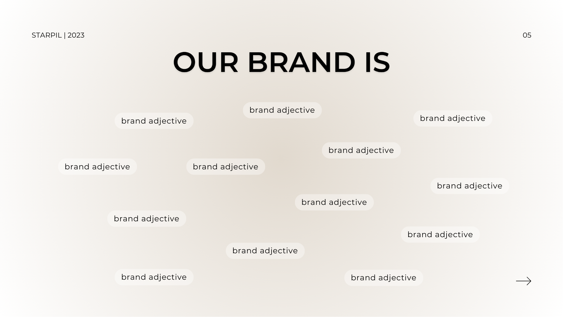
Developing these guidelines also gave me the opportunity to define the brand tone and unique selling point. This was crucial for maintaining a consistent communication style across the company, ensuring that everyone understood how to represent the brand visually and verbally. By defining these elements, the entire team could work cohesively, reinforcing the brand’s identity and values.
To create the brand guidelines, I spent a year testing various content and styles to determine what performed best across all metrics. Drawing from my experience and familiarity with our direct and indirect competitors, I identified the design elements that resonated most with our target markets: at-home retail customers and professional estheticians. Balancing these two audiences was essential, as the brand needed to be relatable and friendly to retail customers while maintaining a professional image to assure professionals of our expertise and product quality.
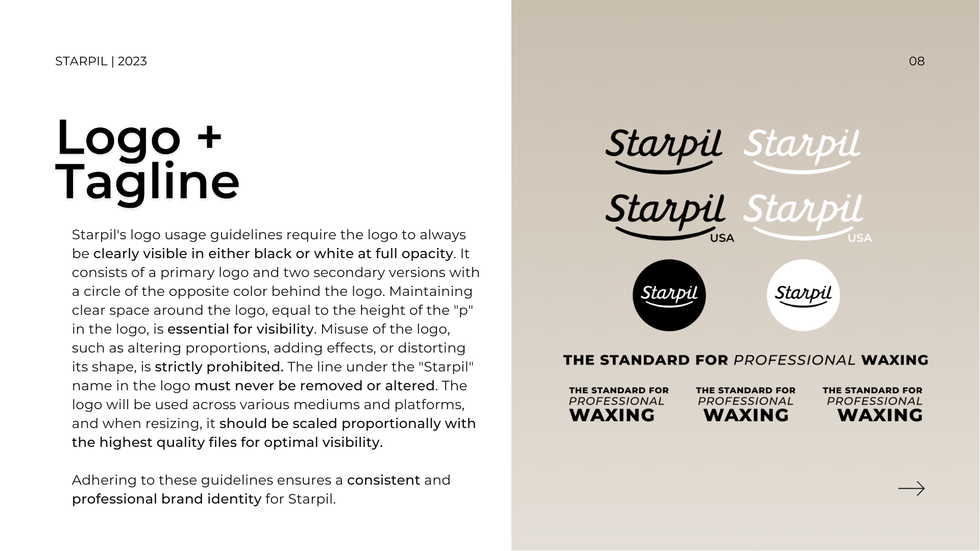
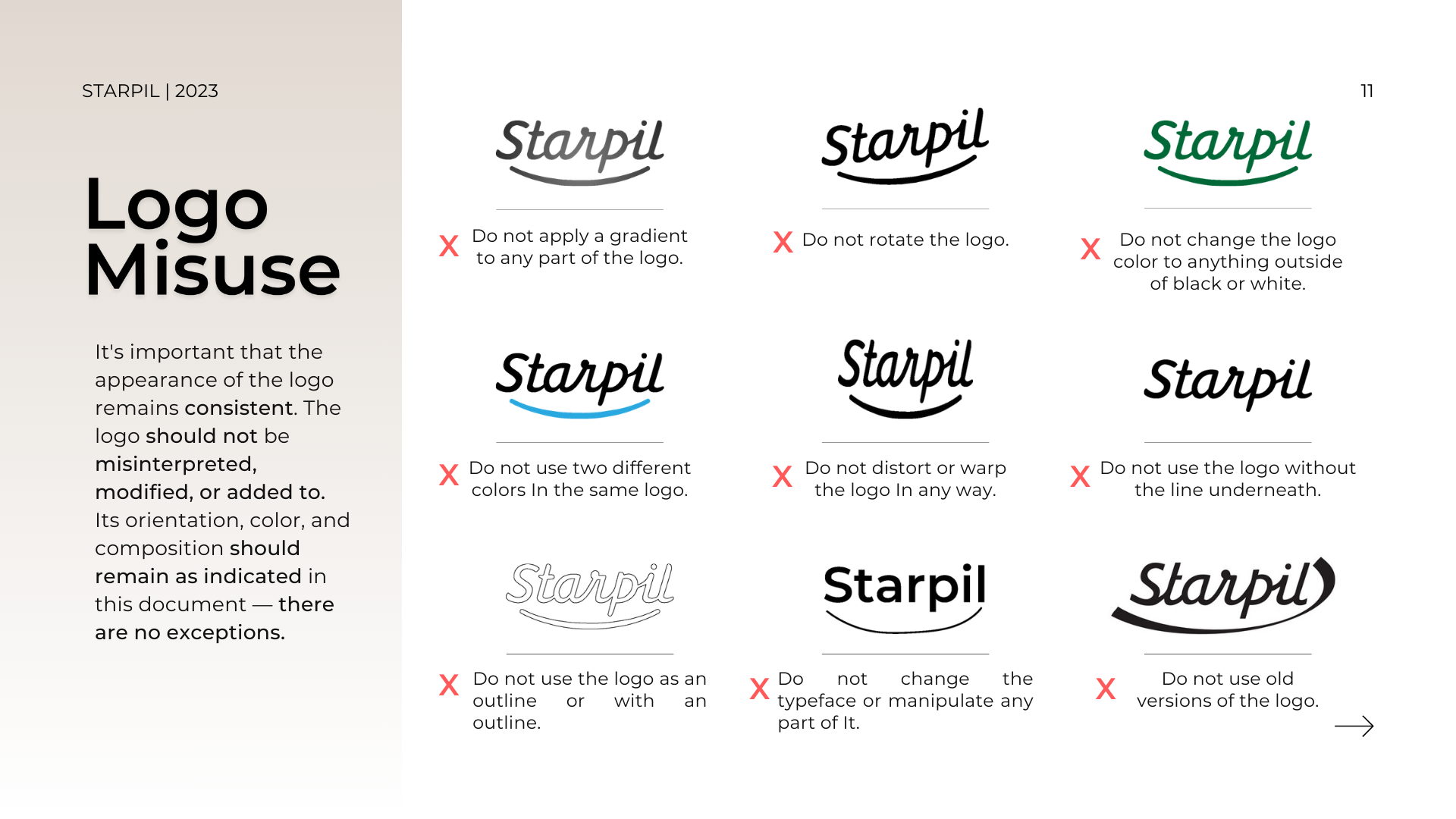
In the brand book, I clearly defined the brand’s perspective, applications, and positioning. I outlined specific design choices that effectively communicated these messages across all mediums. For typography, I specified when and how to use certain font weights and italicizations, providing example combinations for titles and important information. For color usage, I refined the palette to focus on three main neutral/base colors, with additional hues used sparingly as accents. In terms of photography, I led an initiative to capture new content that aligned with the updated brand guidelines. Working with our in-house creative team, we conducted photoshoots to create a library of images that reflected the brand’s purpose. Recognizing a need for patterns in promotional materials, I created a set of icons and patterns representing Starpil’s products.
Using these newly redefined visual identity guidelines, I guided the creative direction of our main website’s design. I ensured that the visual identity matched the guidelines, coordinating the organization of information and sections within different website pages. I revised our homepage, providing new graphics for each section and a better flow of information with visual elements, and redesigned the layout for top-performing landing pages.
Overall, this project was one of the most hands-on branding initiatives I have undertaken. It allowed me to grow with the brand, creating a dynamic and enduring identity that effectively communicates Starpil’s message and connects with its audience. The impact of my contributions is evident in the brand’s consistent and compelling presence across all platforms, reinforcing its market position and appeal to both retail and professional customers.
Initially, the existing brand guidelines covered basic elements like font usage and a color palette, but lacked critical components necessary for cohesive design. This absence of clear guidelines led to creative roadblocks and a slower design process. Given the creative freedom to determine the direction of each campaign, I experimented with various styles to see what resonated most with our audience and leadership.
Through trial and error, I identified the designs that performed best in terms of ad revenue, click-through rates, and other key metrics. About a year into my tenure, I initiated a comprehensive redesign of the brand identity. My goal was to create a cohesive document that would not only guide my work but also serve as a foundational resource for anyone designing for the brand in the future. This effort streamlined the design process, ensuring consistency and alignment with the brand’s mission and target audience.
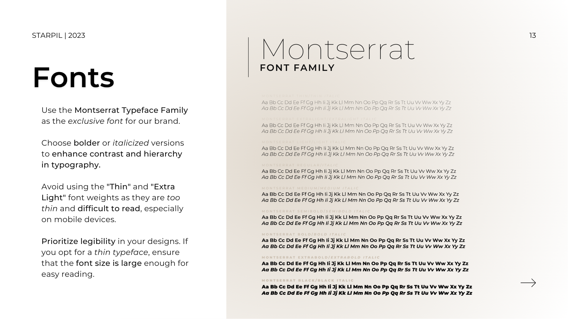
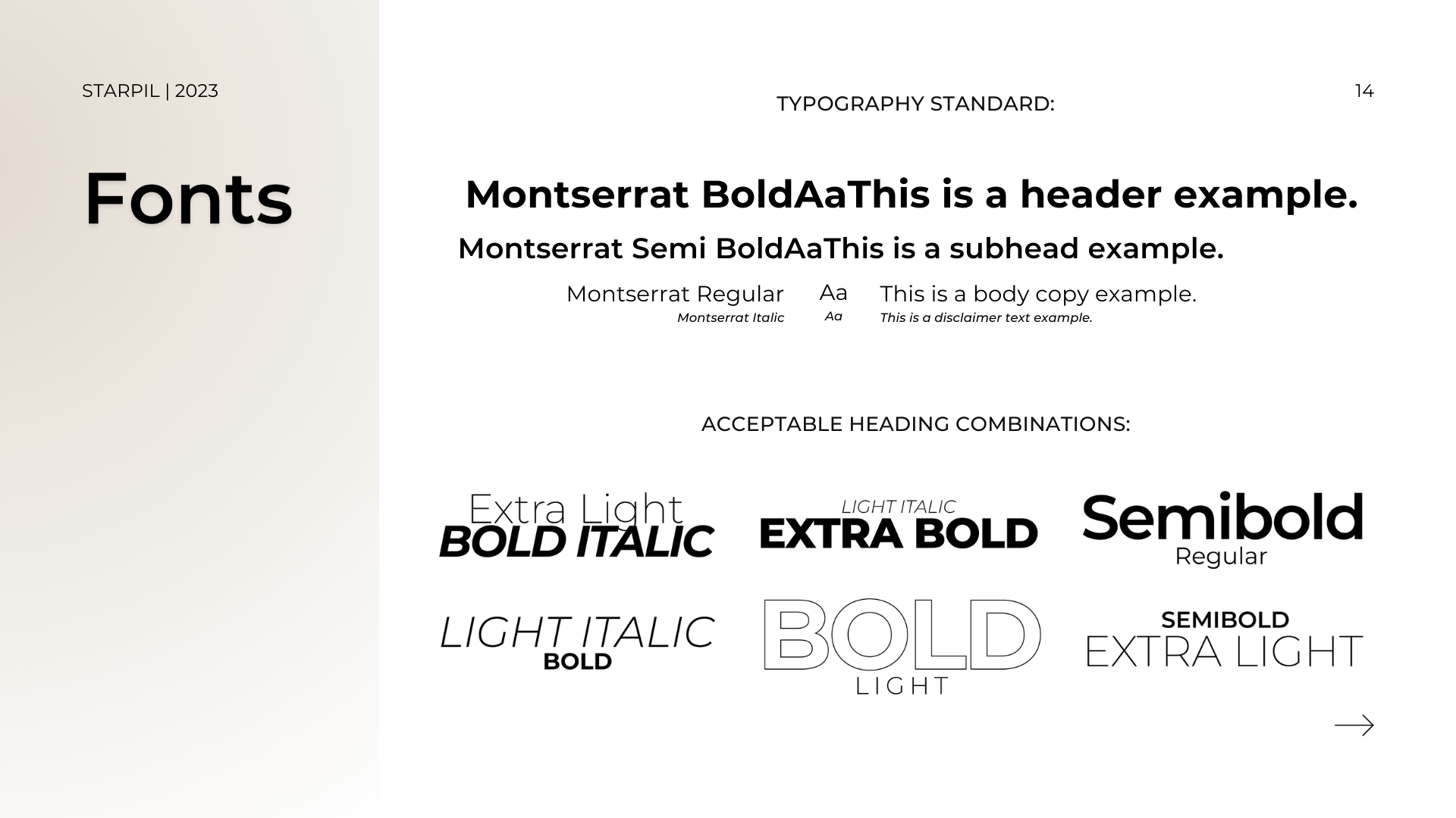
Typography Usage
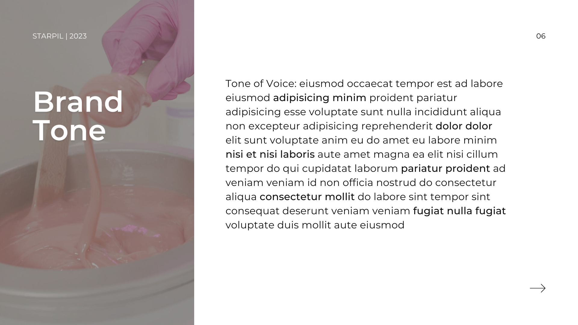
In redesigning the typography for Starpil Wax, I aimed to create a balanced and versatile type system that could convey professionalism and approachability. The main fonts were selected to reflect the brand’s dual focus on retail customers and professional estheticians. By specifying font weights and italicization for different contexts, I established clear guidelines for titles, body text, and important information. Example font combinations provided a base for designers to create cohesive and visually appealing designs, ensuring brand consistency.
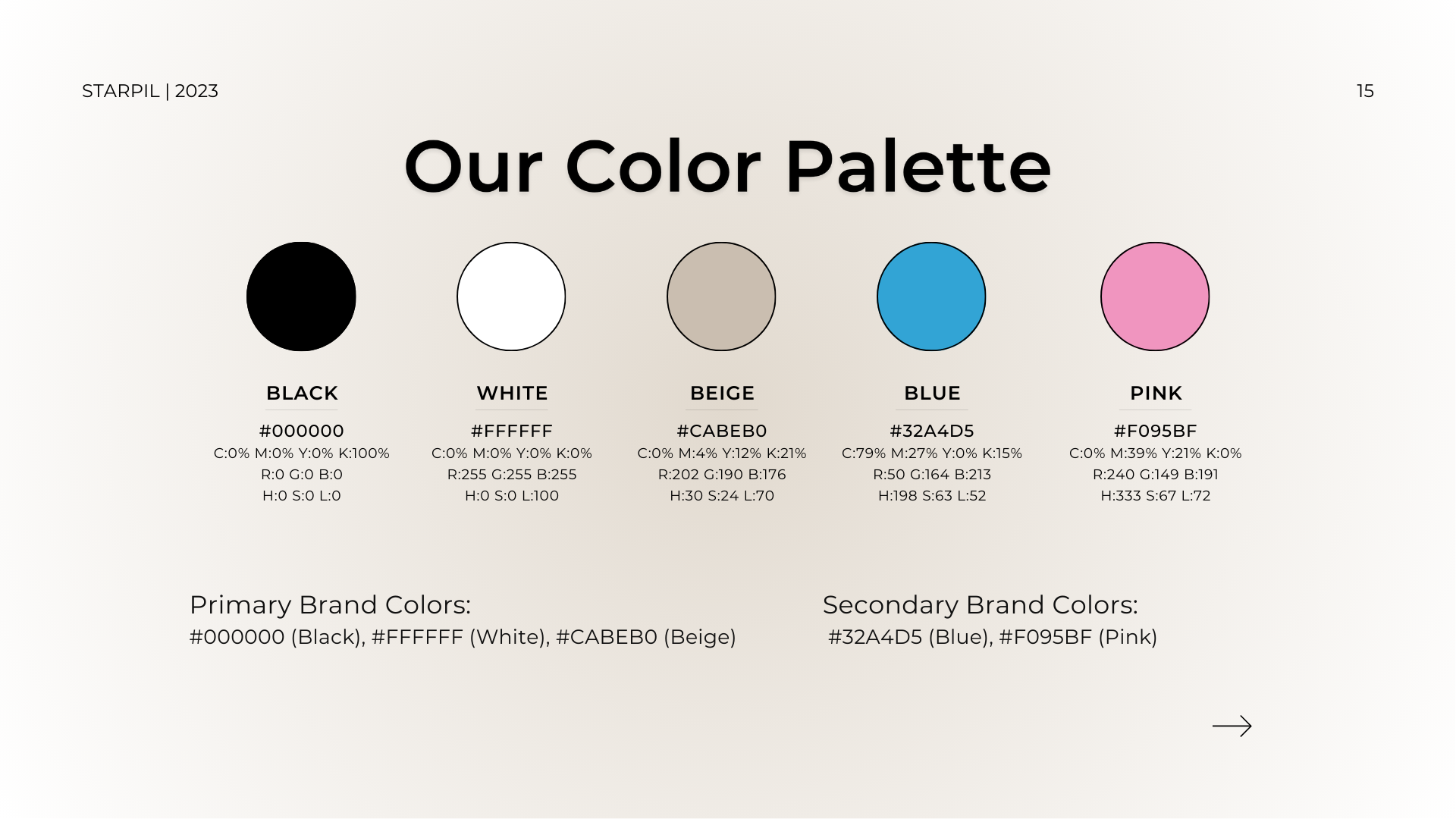
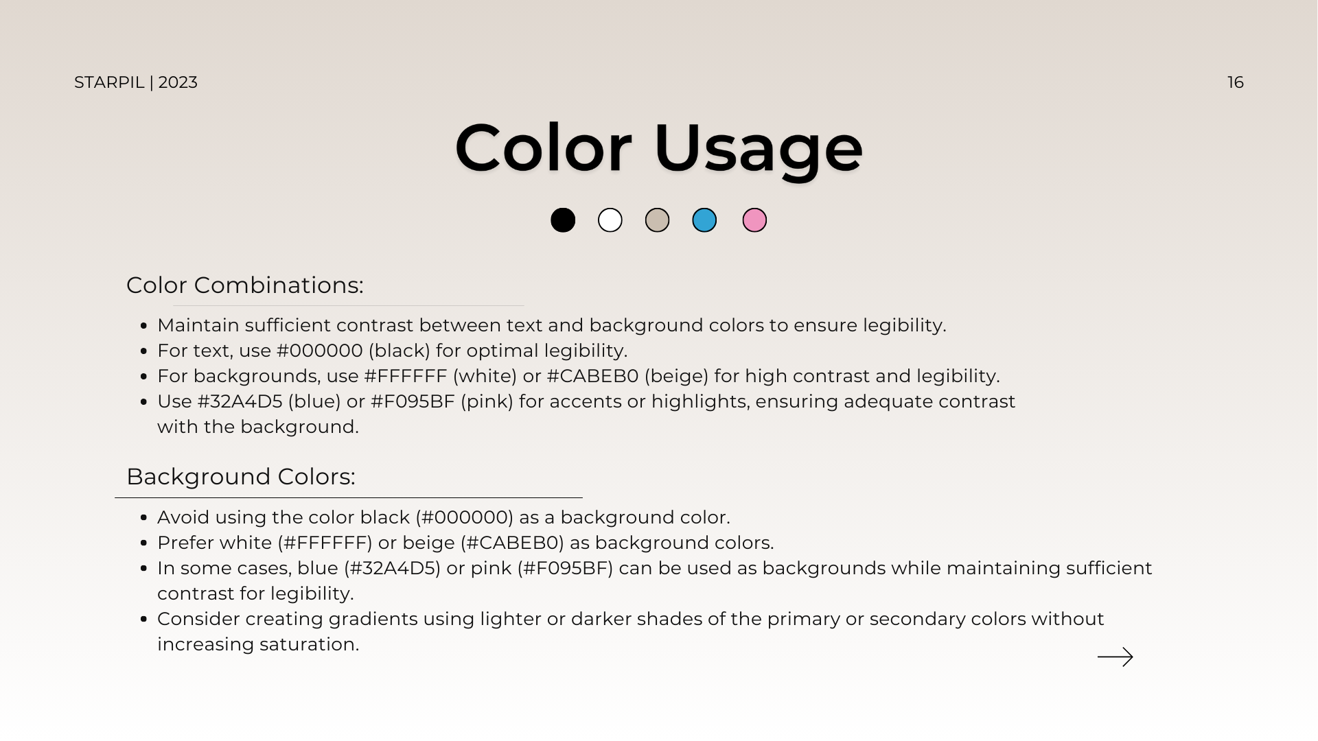
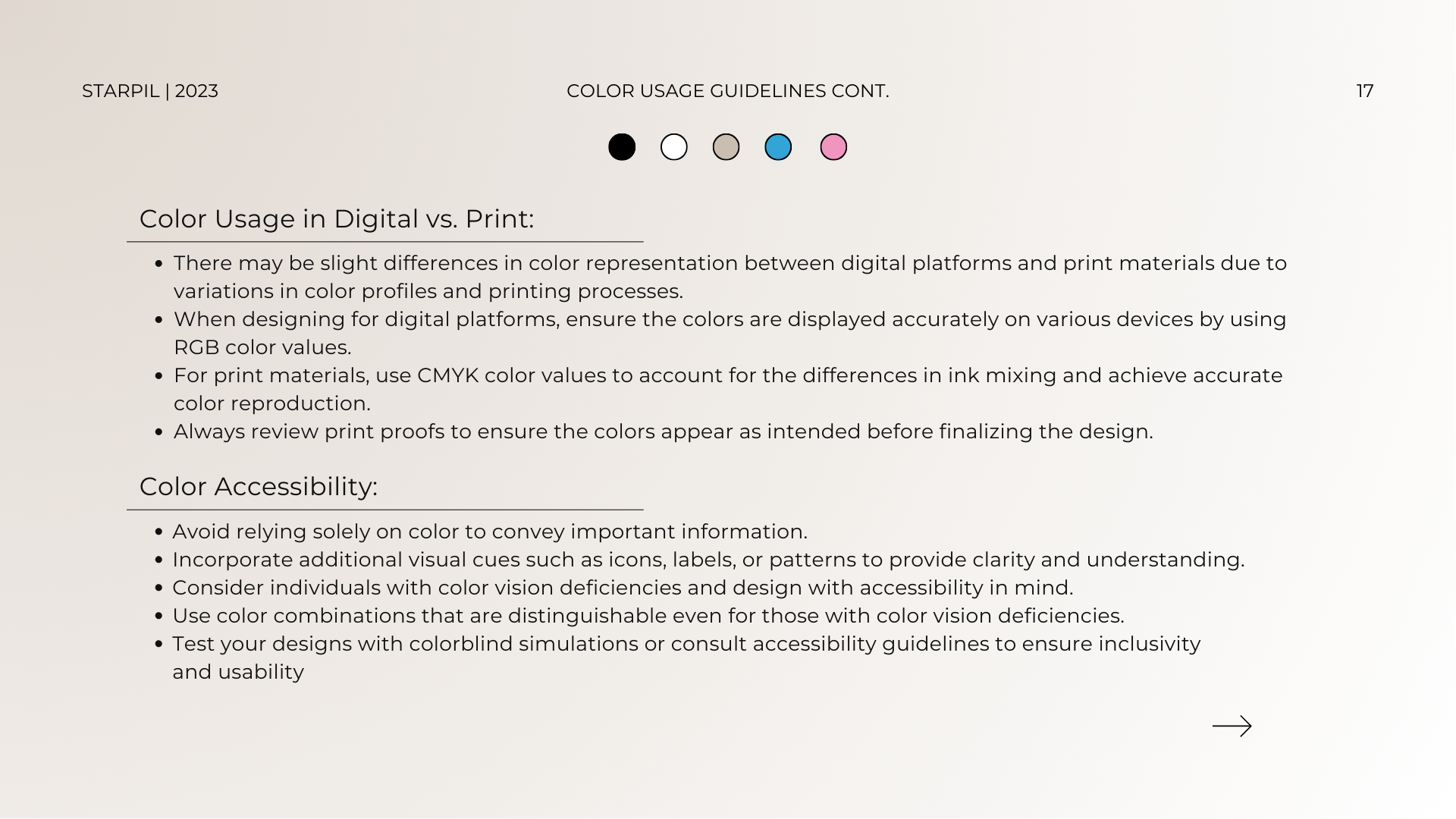
Brand Colors
The color palette was a critical component of Starpil Wax’s brand identity. I refined the palette to focus on three main neutral/base colors, ensuring that additional hues were used as accents. This approach created a harmonious and recognizable brand presence. I shifted away from using all the brand’s bright colors simultaneously in a design, opting instead to apply them more sparingly as individual accent colors on a design-by-design basis. By emphasizing the use of these neutral colors consistently across all materials, I enhanced brand recognition and visual appeal. This cohesive color strategy helped maintain a professional yet approachable tone, aligning with the brand’s dual focus on retail customers and professional estheticians.
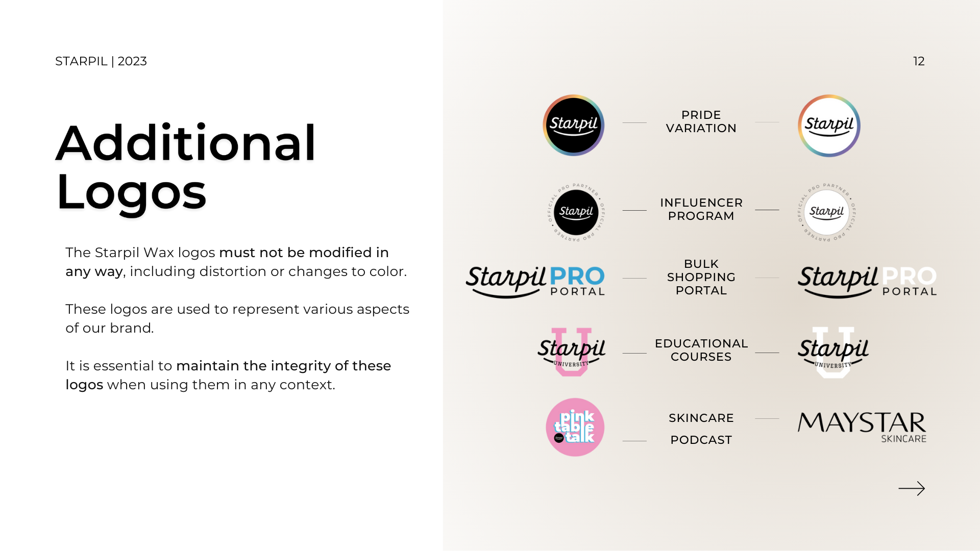
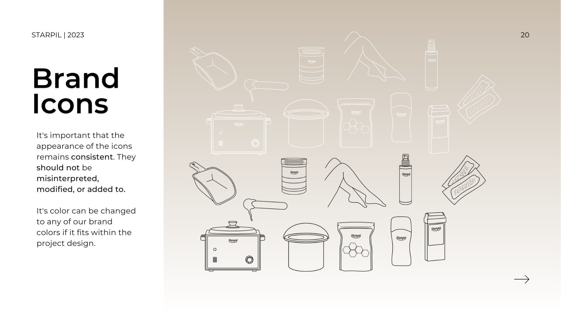
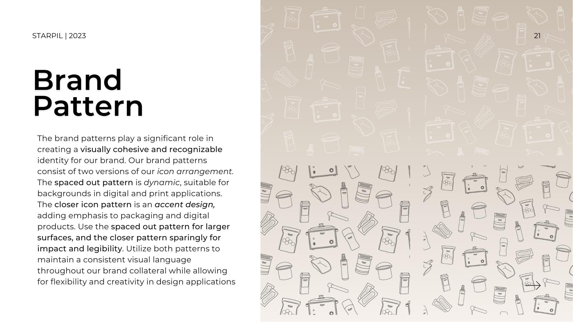
Brand Icons & Pattern
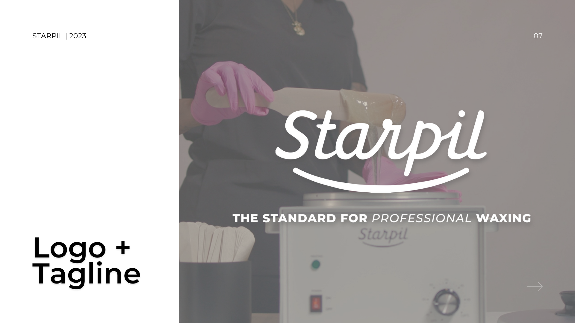
To further solidify the brand’s visual identity, I designed a set of icons and patterns that represented Starpil Wax’s product offerings. The icons, featuring outlines of different waxing products, were integrated into a simple repeating pattern. This pattern was used in promotional graphics, trade show booth designs, and packaging, adding a professional yet friendly touch to the brand’s visual elements. These icons and patterns became an essential part of the brand guidelines, ensuring cohesive and effective design across all applications.
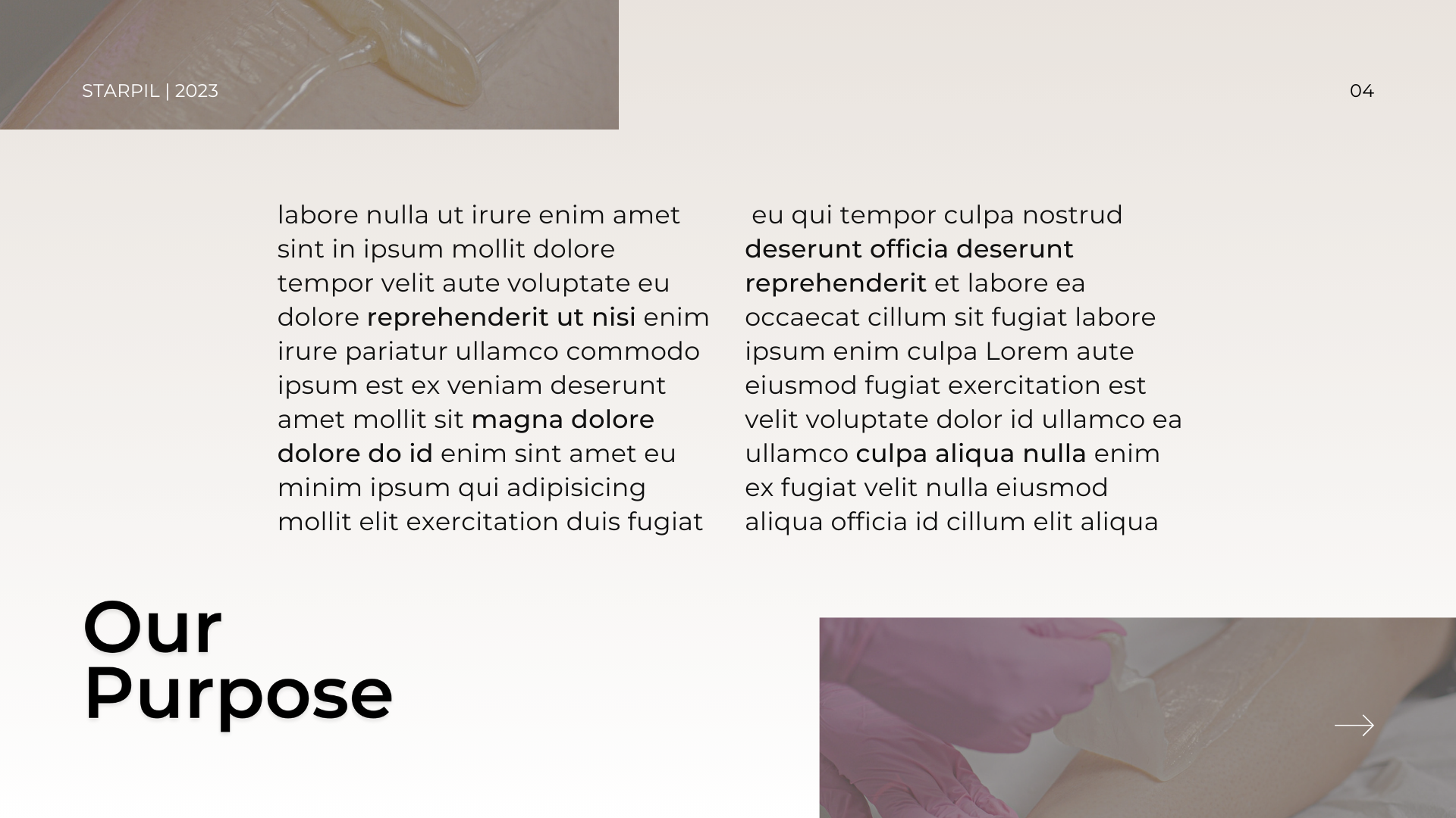
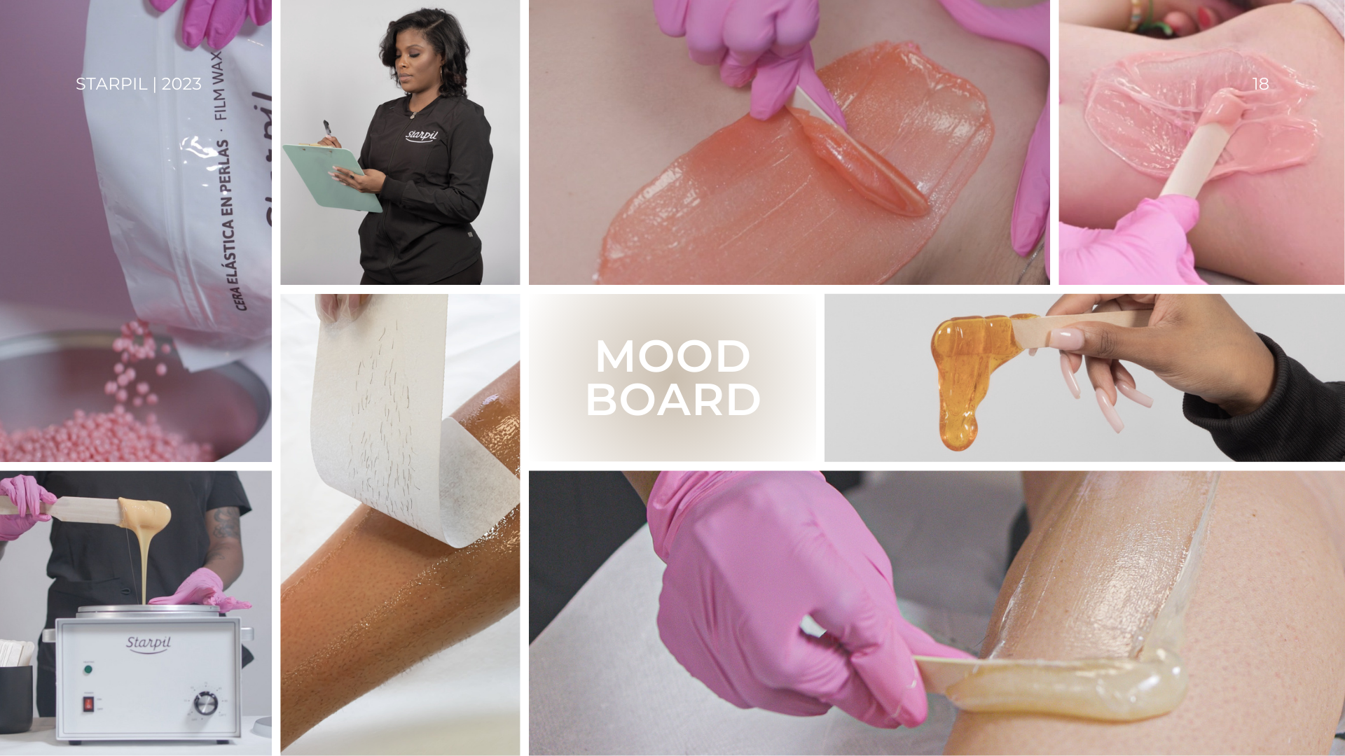
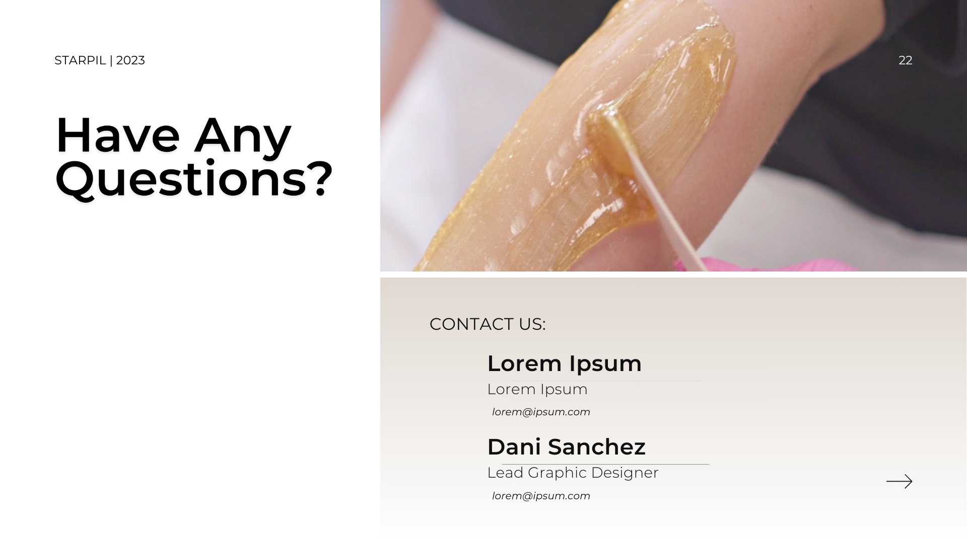
Brand Imagery
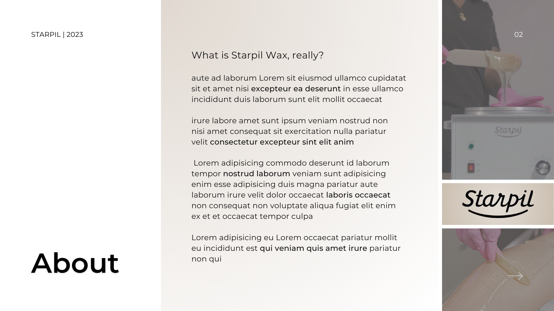
Photography played a crucial role in humanizing the Starpil Wax brand and connecting with its audience. I led an initiative to capture new, high-quality images that aligned with the brand’s purpose and visual identity. Collaborating with our in-house photographer, social media manager, and professional esthetician, we produced lifestyle images that showcased the products in use. This included shots of wax being applied to skin, products being held, and simulated professional esthetician environments. The imagery emphasized professionalism while staying modern, fun, and trendy, aligning perfectly with current visual trends and the brand’s dual market focus.
Brand Book
Through extensive research and experimentation, I identified the key elements that resonated with both the audience and internal stakeholders. This process involved analyzing design performance metrics, competitor branding, and target market preferences. The resulting brand guidelines provided a clear and cohesive framework for all future designs, ensuring that all visual communications were aligned with Starpil Wax’s mission and values. By defining the brand’s perspective, applications, and positioning, I created a dynamic and classic brand identity that has significantly enhanced the company’s market presence.
Revamping Starpil Wax’s brand identity was a transformative project that allowed me to showcase my skills in strategic design and brand development. The comprehensive brand guidelines I created have ensured consistency and cohesion across all platforms, empowering the team to produce visually stunning and effective designs. This project not only strengthened the Starpil Wax brand but also demonstrated my ability to lead, innovate, and deliver impactful results.
Navigate
Let’s Get in Contact
© 2024 DS Design Studio. All Rights Reserved.

Navigate
© 2024 DS Design Studio. All Rights Reserved.