Brand Design:
Starpil University
Brand Design: Starpil University
Developing Starpil University’s brand identity involved creating a professional and educational visual presence that aligns seamlessly with its parent company, Starpil.
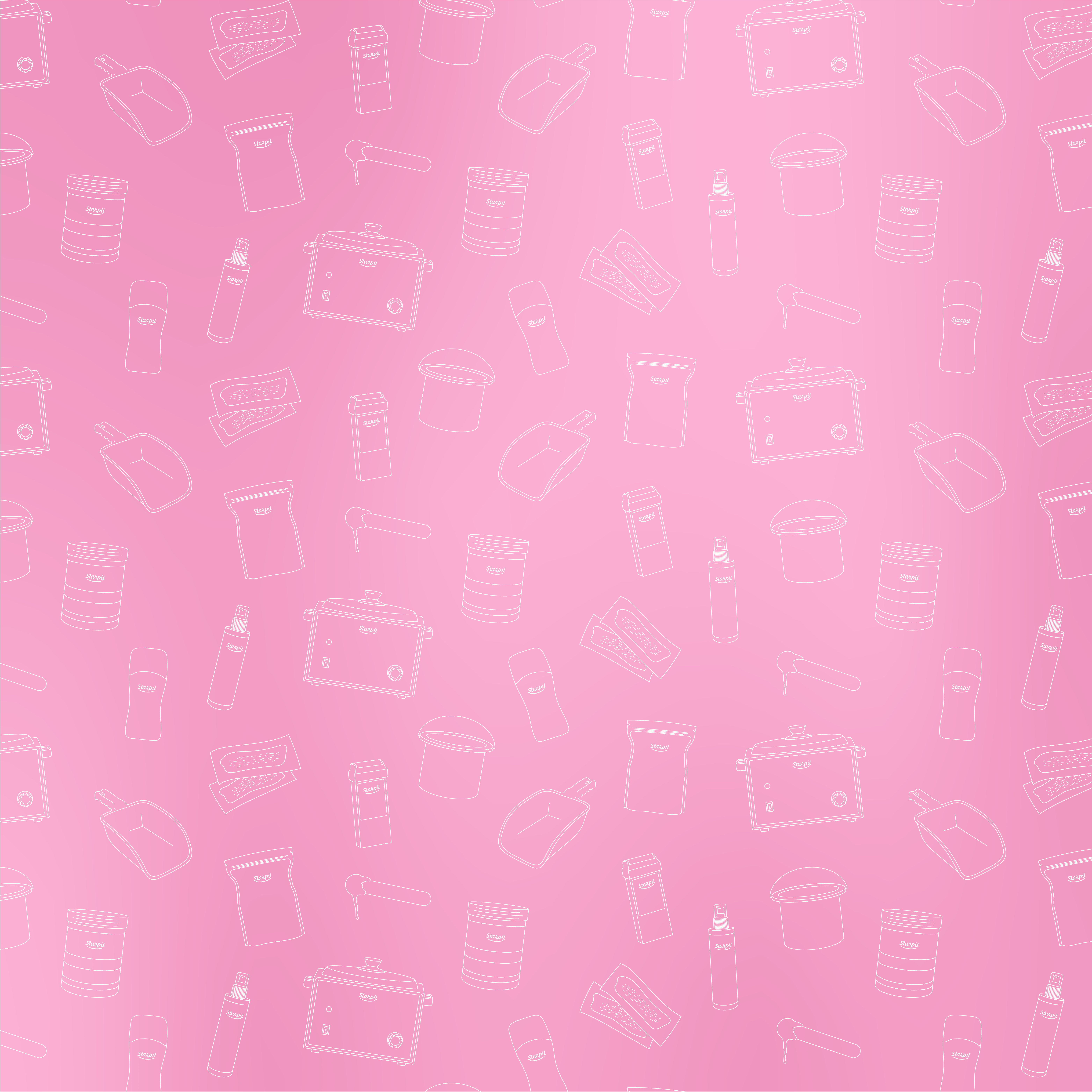
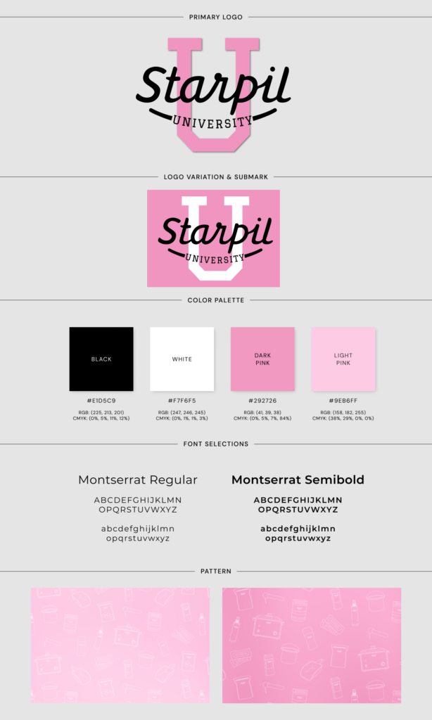
Starpil University (SU) emerged as a project during my tenure at its parent company, Starpil. As the lead graphic designer, I was tasked with developing SU’s brand identity and creating all promotional graphics, website design, and slide deck presentations for the courses offered. The primary objective was to convey an educational, professional, and friendly tone while ensuring consistency with the parent company’s branding. To achieve this, I focused on the pink color from the Starpil palette, utilizing various shades to create a cohesive and engaging visual language. For the main branding elements, I designed gradients ranging from dark to light pink, which were used as backgrounds across different platforms. Additionally, I developed a unique pattern featuring thin line illustrations of various waxing products and Starpil items that students would encounter during their esthetician training. This pattern, combined with the gradients, formed a seamless repeating background used in advertising, educational materials, and the website, ensuring a unified look. The logo for SU was crafted to mirror the parent company’s logo while introducing a distinct academic feel. The word “university” was incorporated beneath “Starpil,” with a large “U” in the background, resembling traditional university logos. The chosen font for “university” and the “U” had classic collegiate attributes, further emphasizing the educational aspect of the brand. Throughout this branding project, I applied these elements to various facets of SU. I developed the home page for the SU website, created templated pages for each course, and designed comprehensive slide decks for the educational courses. Additionally, I curated a webinar presentation, integrating graphic design elements, pictures, videos, and motion graphics. The webinar design ensured compatibility across different digital devices, enhancing the viewer experience.
Starpil University (SU) emerged as a project during my tenure at its parent company, Starpil. As the lead graphic designer, I was tasked with developing SU’s brand identity and creating all promotional graphics, website design, and slide deck presentations for the courses offered. The primary objective was to convey an educational, professional, and friendly tone while ensuring consistency with the parent company’s branding. To achieve this, I focused on the pink color from the Starpil palette, utilizing various shades to create a cohesive and engaging visual language. For the main branding elements, I designed gradients ranging from dark to light pink, which were used as backgrounds across different platforms. Additionally, I developed a unique pattern featuring thin line illustrations of various waxing products and Starpil items that students would encounter during their esthetician training.
This pattern, combined with the gradients, formed a seamless repeating background used in advertising, educational materials, and the website, ensuring a unified look. The logo for SU was crafted to mirror the parent company’s logo while introducing a distinct academic feel. The word “university” was incorporated beneath “Starpil,” with a large “U” in the background, resembling traditional university logos. The chosen font for “university” and the “U” had classic collegiate attributes, further emphasizing the educational aspect of the brand. Throughout this branding project, I applied these elements to various facets of SU. I developed the home page for the SU website, created templated pages for each course, and designed comprehensive slide decks for the educational courses. Additionally, I curated a webinar presentation, integrating graphic design elements, pictures, videos, and motion graphics. The webinar design ensured compatibility across different digital devices, enhancing the viewer experience.
Navigate
Let’s Get in Contact
© 2024 DS Design Studio. All Rights Reserved.

Navigate
© 2024 DS Design Studio. All Rights Reserved.